an annoying AI icon
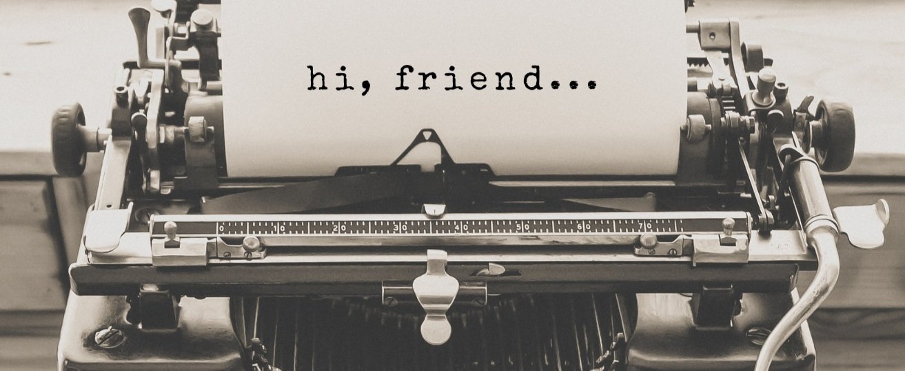
After several months off, it feels energizing to once again be in a rhythm of connecting with you. As I write this, though, there is an annoying little icon that has started to appear below each line. Here’s what it looks like:
Apparently, I can click the icon and AI will present a “better” version of what I’m trying to say to you right now.
I find this visually disruptive to my creative flow.
There is also another feature which automatically trims long paragraphs because, in the words of my email provider, “When you keep your sentences under 25 words, the content of your email under 200 words, and use smaller words, you'll have a higher skimmability score.”
This is all a bit alarming…
I don’t know about you, but “skimmability” isn’t my primary goal when trying to communicate something meaningful.
And I refuse to agree with the notion that we should dumb-down and depersonalize our writing, or any other method of communication, in the name of speed, efficiency, or “clicks”.
Do we really want to trade the beautiful complexity of our TRUE voices for something generated by a machine?
And do we really believe people can no longer read sentences longer than 25 words?
If you’ve gotten this far, then you’re my people. :)
As for me, as soon as I hit “send” on this post I’m gonna do a little sleuthing on how to turn these darned AI icons off in the future.
For TRUTH (and humanity)…
- Constance